Case Study: Captain's Quarters Resort Mobile Conversions
Situation & Objective
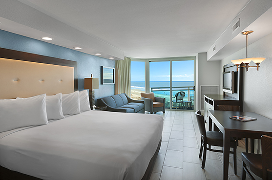 Captain’s Quarters Resort was in need of improved user experience on their website due to high percentage of visitors to the site via mobile phones and very low conversion rate.
Our goal was to better the mobile user experience from entry-point and throughout the booking process and increase direct bookings from mobile visitors.
Target Audience
Target audience included neighboring Myrtle Beach, SC states (New York, Connecticut, New Jersey, Ohio, North Carolina, South Carolina, and Georgia), mobile visitors, and predominantly females with families.
Research & Planning
 We reviewed the existing behavior on the site and determined fallout points throughout the booking process. We determined that 62% of site traffic came from a mobile phone, yet bookings were only 33% –with desktop/laptop significantly outperforming mobile.
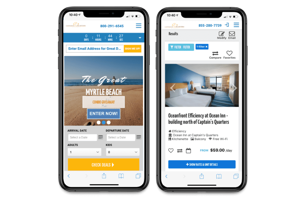
A new mobile-first website was built, including a changes to the booking engine to reduce friction in the mobile booking process. The website and booking engine were built to be fully responsive, including simple navigation, enticing photography, and iconography to convey information more efficiently on a smaller screen. Booking engine changes were intended to reduce friction on a mobile device and included keeping the experience within the same domain, not opening the process in a new window, and maintaining a consistent look and feel throughout the booking journey. We also added room comparison, filters, and favorite features, as well as availability calendars for each room type. A deals countdown function was added throughout the site, and urgency and social proof messaging were added as options in the booking engine to further encourage the visitor to book quickly.
Message & Implementation
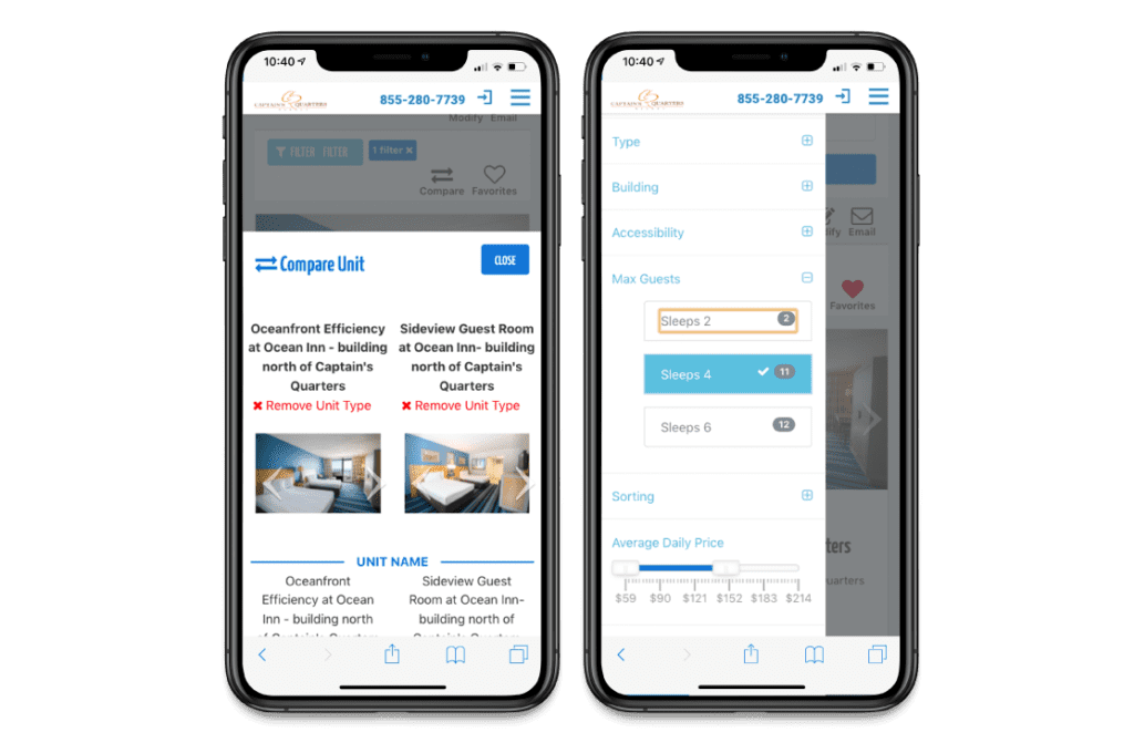 Captain’s Quarters Resort is a great family-friendly resort. We focused the messaging on promoting the family-friendly amenities, such as a water park and a bowling alley, and leveraged high-quality photography to generate an emotional connection with the guest.
We encouraged guests to book direct by offering exclusive perks and lowest rate guarantee.
We leveraged psychology to increase the chance of getting a quick conversion. We introduced social proof by using messaging such as “1000 people have booked this room within the past 30 days” and showing reviews of happy guests. We also used fear of missing out by showing messages such as “Only 2 rooms left for your selected dates.”
Results
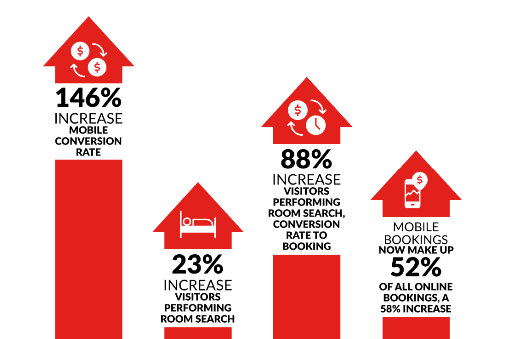
Both goals of the website redesign were met. Since the launch of the new site overall conversions, visitors, bookings, and mobile reservations have increased.