You’re welcome, by the way.
Are you a current traveler, future traveler, or tech junkie? If so, you have probably contemplated downloading or have already downloaded a travel related mobile app.
Almost 90% of American adults own a smartphone, so it is not hard to see why mobile app usage is on the rise. The travel segment was honestly behind the curve in many aspects when it comes to dabbling with their own dedicated white label app for hotels, though they are catching up fast.
A young traveler myself, I decided to save our great fan base a lot of wasted time and energy and try every single travel related app I could find so you don’t have to!
The Fine Print:
The travel apps I reviewed were all related to finding and booking a room. There were some that I came across that promoted themselves in this space but ended up not quite meeting the needs of a “ready to book” traveler (ps, there are some not booking related gems at the bottom for those of you who make it that far). I also left branded hotel apps off the list because there’s only so much time in a day and there are gated features that are only available if you have an existing reservation so it would not be a full review.
Speaking of reservations, I did go as far as I could through the booking process but did not actually book with any of these providers. I understand that some of these offer a much more streamlined booking process once your personal information is saved. However, I wanted to approach this with a completely first time experience perspective.
Finally, these reviews are also based on my knowledge of the travel and tech industry but are ultimately my personal preferences. I provide ratings on user interface from a design and usability perspective, a few general pros and cons, an overall rating, and then a commentary of my experience navigating through the app.
Booking.com
Design: 3.5 / 5
Usability: 4 / 5
Pros: Easy to use and navigate; lots of cool features – travel guides, destinations you could explore, “secret deals”, etc.
Cons: Many screens were loaded with information – overwhelming; booking process was a bit bulky
Overall Rating: 3.75 / 5
Comments:
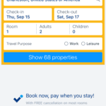
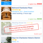
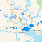
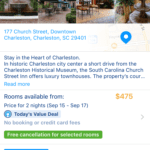
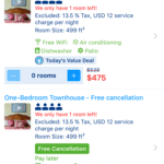
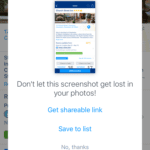
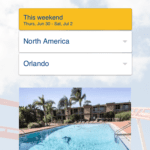
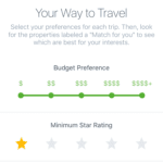
The initial Priceline screen prompts users to sign in or create an account. You then fill out a form with destination, travel dates, and reason for travel (business or leisure). The hotels screen is a little busy with lots of info presented. The profile summary includes a tiny hotel image (not appealing), hotel name, star rating and overall rating (out of 10), distance from current location, latest booking (in hours), how many rooms are left, and current rate for x amount of nights selected. It will also show if a property is sold out. I applaud the attempt at social proof and marketing psychology, but this seems overboard. The individual property page features several images that seemed of a much better quality, a summary, booking and room fees, reviews, policies, facilities, and important information. The next page allows you to select a room type – again – very busy. There were several more steps before booking. There are options to personalize the details of your trips or to personalize your app preferences in the profile portion. The “more” section offers a ton of hidden content. Travel guides are offered but only if you book a stay. You can explore destinations for “trip-spiration” and unlock “secret deals”. You also get a notification for taking a screen shot prompting you to get a sharable link or to save to a list. Overall, the app offers a plethora of useful information but the design could be cleaned up across the experience. Booking.com is owned by the Priceline Group.

Priceline
Design: 4 / 5
Usability: 4 / 5
Pros: Easy to navigate; bidding structure was unique
Cons: Overwhelming amount of information / filters; confusing “name your price” tool
Overall Rating: 4 / 5
Comments:
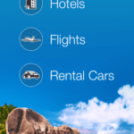
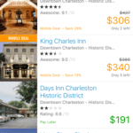
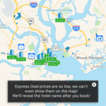
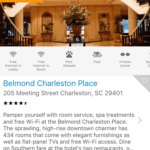
The initial app screen displays three clean icons for “hotels”, “flights”, and “rental cars”. Upon selecting “hotels”, you will be taken to a screen that auto-fills your location and travel dates, though they are easy to update. The hotels screen displays a list with two “mobile deals” pinned at the top. Users can choose to view all hotels (default screen), view Express Deals, or name your own price. The name your own price tool allows you to select a region within your destination, a star level, and a bid per night. Once submit, you are prompted to sign in or create an account and then enter payment information. This process was a little confusing. It seemed to be a manipulation of the room rates and resort fees. There are also tons of filters for searchers to apply to narrow down options. The hotel profile pages featured high quality images, an interactive map, and guest reviews, though they lacked other information that was readily available in other apps. Priceline owns several other travel brands that we discuss below.

Kayak
Design: 4.25 / 5
Usability: 4.25 / 5
Pros: There were some nice hidden filters / features under “more”; straightforward / easy to use and navigate; price alerts
Cons: The map section of the app was a bit clunky; booking.com promotions were all over the place
Overall Rating: 4.25 / 5
Comments:
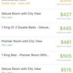
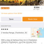
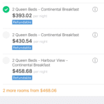
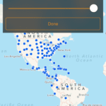
The Kayak home screen allowed search options for hotels, flights, and cars. There was a banner on top of the page for Booking.com deals that loaded a Booking.com page within the app. There was also an option to toggle how prices were listed / organized (nightly base price, nightly + local taxes and fees, or total stay + taxes and fees). Additional filters and a map view are also available. The app allows you to set price alerts for hotel prices and airfare. The app also has a cool explore feature where you can apply travel filters for beach, gambling, golf, and ski, temperature, budget, country, dates, etc. that was pretty handy (though it was hidden under the “more” section of the app). Kayak is owned by the Priceline Group.
Expedia
Design: 4.5 / 5
Usability: 4.5 / 5
Pros: Comprehensive; Nice design
Cons: Load time seemed on the slow side
Overall Rating: 4.5 / 5
Comments:
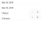
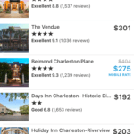
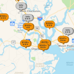
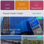
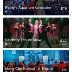
Expedia offers an attractive interface from start to finish. The top features 5 color block categories for services – hotels, flights, cars, activities, and transport. Below that, Expedia defaults to “popular hotels tonight” with a scrolling screen of hotel options. Each hotel square features a high quality image, guest rating, price, and percentage discount. The hotel profile pages contain plenty of property information, images, and an interactive map. Some of the images were not the best quality, but overall they seemed acceptable. The app also allows for users to book by phone or via the app. Other app features were equally appealing and easy to use. My favorite part was the date selection tool, it allowed you to easily select your arrival and departure date without clicking out of the window or having to click in multiple places (similar to other apps owned by Expedia). Finally, Expedia offers information on area activities and the ability to purchase tickets directly through the app. Expedia also owns several other travel brands that we reviewed below.
Hotels.com
Design :4 / 5
Usability: 5 / 5
Pros: Easy to use design; Loyalty program
Cons: Only covers hotels, not ideal if planning full trip; Lots of info to input before you can view properties & deals
Overall Rating: 4 / 5
Comments:
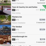
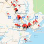
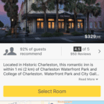
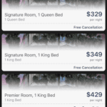
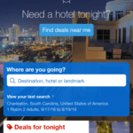
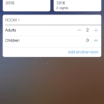
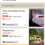
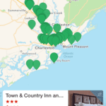
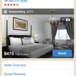
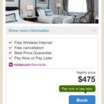
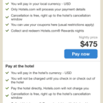
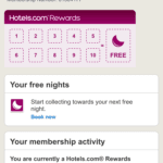
The initial impression of Hotels.com was a bit lackluster. The app has several settings you need to specify before getting started. When you finally arrive, you are prompted to answer the question “where are you going?” and enter a destination, hotel, or landmark. You must enter a location and travel details (dates, # of travelers) before scanning hotels. A simple list appears that displays total number of hotels available and a scrolling list. You can also choose different filters, a map view, or a call button. The hotel profiles are simple with a basic overview, reviews, hotel map, facilities, and nearby activities that scroll over to a new screen with written content. The rooms are in a list under the basic hotel information and not on a separate page; a link anchors you down to that part of the page when you click “book now”. Images throughout the app are all very high quality. The Hotels.com loyalty program is also very present throughout app. Hotels.com is part of the Expedia group.

Travelocity
Design: 4 / 5
Usability: 5 / 5
Pros: Easy to use design; Loyalty program
Cons: Only covers hotels, not ideal if planning full trip; lots of info to input before you can view properties & deals
Overall Rating: 4.5 / 5
Comments:
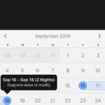
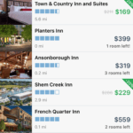
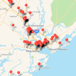
The Travelocity app home screen showcases beautiful destinations with subtle word clouds describing the destination being shows. On the bottom, you can choose to browse hotels, flights, cars, or activities. There are additional options for shop, trips, and account. The date calendar was nice in that it allows you to select both arrival and departure in one simple step. The hotels list is a little basic with small images and not a ton of information aside from price and rating. Some discounts are presented and you have the option to sort with a variety of filters. The hotel profiles were much more impressive that the initial list. They featured large, high quality images, reviews, map, tons of hotel info. You will see the option to pay via the app or to book by phone. Travelocity also features local attractions with the ability to purchase tickets in advance through the app. Travelocity is part of the Expedia group.


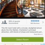
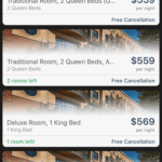

Seems similar to Expedia?
Orbitz
Design: 4.25 / 5
Usability: 4.5 / 5
Pros: Easy to use design
Cons: The design throughout the app from an aesthetics perspective was clunky and busy throughout the entire app; hotel pages lacked images and information
Overall Rating: 4.25 / 5
Comments:
The Orbitz app homepage offers a clean, modern design. The top portion offer 4 choices: hotels, cars, flights, activities. The bottom portion features “Staff picks” destinations with appealing images. Though busy, the execution was far superior than other attempts by similar travel apps. The date selector immediately pops up after you enter a destination and is one of my favorite calendar tool executions (same as Travelocity above). The hotel list offers clean profile previews with plenty of information.The individual hotel profiles are also clean and useful and offer the ability to book via the app or to book by phone. Some of the hotel images on profiles was stunning, other photos provided a much lesser quality. The app also showcased several local attractions with the option to purchase tickets via the app, which was pretty handy. Though very similar to the Travelocity App, I feel this version fell short in a few areas. Orbitz is part of the Expedia group.
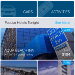
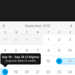
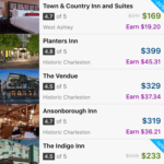

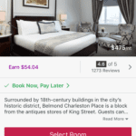
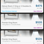
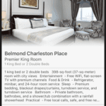
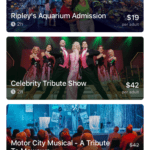
Very similar to the Travelocity app!
Hotwire
Design: 2 / 5
Usability: 3.5 / 5
Pros: Easy to use interface
Cons: The design throughout the app from an aesthetics perspective was clunky; hotel pages lacked images and information
Overall Rating: 2.75 / 5
Comments:
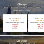
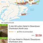
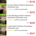
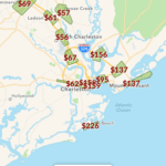
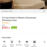
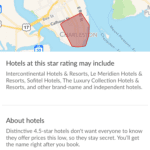
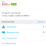
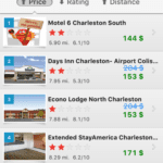
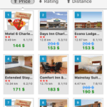
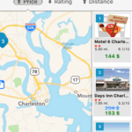
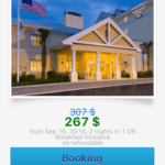
The home screen was a bit different than others – it presented several large destinations in a block format that included keywords, rates, and featured hotels – before you even enter any information. You can also choose to search for hotels or cars. The hotels listing page was a bit unlike other similar apps. Instead of a large list, hotwire showcases a map view on the top half and a list view on the bottom half. It struck me as a bit clunky and the execution was questionable. The listings featured a generic bed image with a star rating ad % off sticker on the top, a star rating and thumbs up % recommended, the hotel name, and two prices – the actual price and the discounted price. The initial organization was also absurd, though you could easily choose to refine. The hotel pages also left something to be desired. There were no images for many hotels and the information provided was a bit scarce compared to other sources. It also provided a “shaded area” for the hotel location that wasn’t very precise. There were several steps involved with finding and booking a hotel room. Hotwire is part of the Expedia group.


Hotel Tonight
Design: 5 / 5
Usability: 5 / 5
Pros: Sleek, modern design; very easy to use; profile pages contain tons of info; easy booking system; invite and escape sections were unique
Cons: Some of the images on the hotel profile pages seemed user-generated / not the best quality
Overall Rating: 5 / 5
Comments:
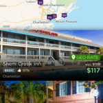
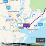
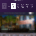
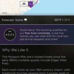
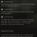
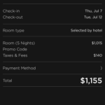
The app opens with a popup for a discount for paying with Apple Pay. Overall, the entire experience provides a much more modern design than other travel apps and flaunts a dark color scheme. The home screen seems to skip the whole “getting to know you” phase of other apps and jumps right into bed (literally) with a dual hotel / map listing screen. You can also search for a new location or enter new search dates at the top. The listings use high quality images and provide a lot of information without seeming cluttered. Hotel name, thumbs up % rating, pricing and “geo rate” discount, and distance / area listed. The hotel profile page auto-scrolls through images that seem to be user submitted – quality wasn’t perfect but they seemed an accurate representation of the property. Profile also includes map / distance from current location, reviews, why we like it, amenities, guest feedback, photos from guests, and “need to know” with a final option to book now. Payment options were easier than other apps – you can scan a credit card or use PayPal. The app also includes a section to share the app to receive discounts (customized code), an “escape” section for saved hotels, a bookings section for saved trip info, and an account edit.



Agoda
Design: 4.5 / 5
Usability: 4.5 / 5
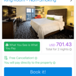
Pros: Extremely easy to use; Clean, simple design; I also really liked the “what you see is what you pay” feature.
Cons: No info on the destination, things to do, etc.
Overall Rating: 4.5
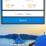
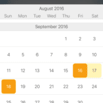
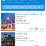
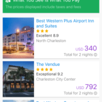
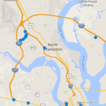
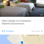
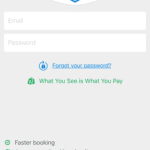
Comments: The app begins with a simple interface that asks you to input a destination, travel dates, and number of guests. Upon completion, you are directed to a hotel list view screen that shows a long list of available area hotels. The icons provided sufficient information before clicking to the profile without seeming cluttered or overwhelming. The app also offers a nifty “what you see is what you pay” feature that could be switched on to see the full price after taxes and fees. You will see the full room price and get to the payment portion of the transaction before being asked to either “sign in” or “continue as guest”. Agoda is part of the Priceline Group and is primarily used in Asia.

HotelSnapper
Design: 1 / 5
Usability: 0 / 5
Pros: N/A
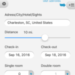
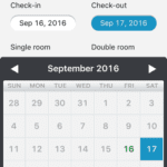
Cons: Doesn’t work properly; horrible design and functionality
Overall Rating: 0 / 5
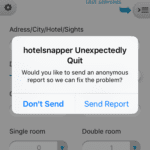
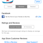
Comments: This app is atrocious from start to finish. I could not even finish my evaluation because it kept crashing. The one review they have in the app store verifies this. 10/10 would not recommend.

Travel Butler
Design: 2 / 5
Usability: 2 / 5
Pros: Easy to use and navigate
Cons: Not nearly as useful as it could be – No booking component, No variety or personalization when it comes to recommendations, No way to add things to a travel itinerary.
Overall Rating: 2 / 5
Comments:
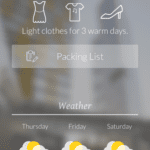
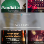
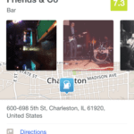
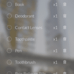
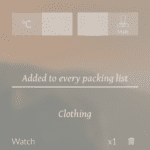
Travel Butler begins with an immediate prompt to enter in travel information: destination, dates, gender, business or leisure. After selections are made, the next screen provides a variety of useful information. What you should bring (packing), weather, popular restaurants / bars / attractions, etc. (powered by Foursquare). The app introduces an interesting concept but the information provided wasn’t a good fit for me personally and the images were of really poor quality. Clicking into a profile opened up a page that prompted you to download the Foursquare App with tiny “maybe next time” text in gray at the bottom. From there, you can scroll and see info about your selection. You will notice that larger destinations had better page content than smaller destinations, so it is perhaps slightly more useful in certain destinations. There was no hotel search or booking functionality associated with this app.
TripIt
Design: 3.5 / 5
Usability: 2 / 5
Pros: Great concept, particularly for frequent travelers; ability to auto-fill travel details via email scan
Cons: Paid version for full features; not very intuitive from usability perspective; lots of into to manually fill in for trip details
Overall Rating: 2.5 / 5
Comments:
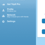
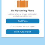
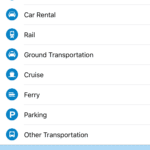
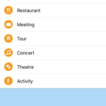
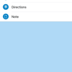
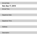
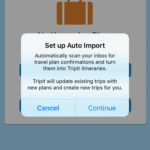
The initial TripIt screen prompts user to log in or create an account. There is also a question presented “What IS TripIt, anyway?” with several simple scrolling panels that explain the app before you begin. The main screen is a bit confusing. You have options to create a trip, get alerts / updates, get TripIt Pro, update your profile, network , or settings. The Trip Planning form ask several questions and is very simple in design. You can either manually add plans or auto-import plans. Auto import will scan email inbox for travel plan confirmations and turn it into itineraries. Otherwise, you can add in specific travel info. No auto-fill info available for activities, hotels, flights, etc. – you have to fill it all in manually. Basically, this app seems like more work than it is worth.
Ctrip
Design: 3.5 / 5
Usability: 4 / 5
Pros: Easy to navigate
Cons: Underwhelming design; hotel profile pages lacked detail and images
Overall Rating: 3.75 / 5
Comments:
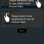
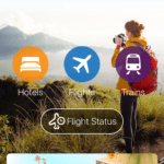
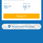
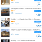
The initial Ctrip screen has three plain scrolling panels that explain app. The next screen prompts you to sign in or become a member (no Facebook or social integration). After registering, you can either go to account or plan a trip. Account includes all of the standard information (bookings, bank cards, favorite hotels) in addition to promo codes, ctrip points, and c-money. Back on the main screen, users can choose to search for hotels, flights, or trains. This screen looked rather nice, aside from the huge banner ad at the bottom of the page. Date selection was a breeze and the hotel list was fairly standard, with several filter options and a map view. The hotel profiles were a bit sparse and many room types were missing images, though the booking process seemed pretty straight forward. Ctrip is primarily used in Asia, though Priceline.com invested heavily in the app in 2014.


TripAdvisor
Design: 5 / 5
Usability: 4.5 / 5
Pros: Incredibly comprehensive – info on destinations, attractions, hotels, and more; ability to book rooms or make reservations via the app
Cons: The sheer size of the app and amount of information provided can be overwhelming
Overall Rating: 4.75 / 5
Comments:
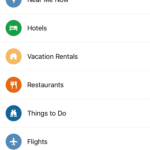
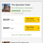
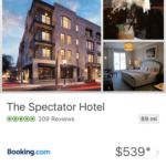
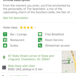
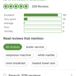
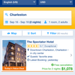
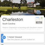
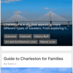
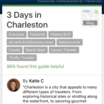
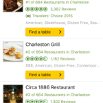
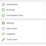
The main TripAdvisor screen provides a brief intro to the app via three scrolling panels. Then, you are presented with a variety of search options: near me now, hotels, vacation rentals, restaurants, things to do, flights, destination guides, forums, and then top 10 destination. The bottom navigation allows for a search, saves, review, timeline, or personal account. The hotels screen is simple with a hotel image, name, rating, reviews, badges, and then booking buttons for TripAdvisor and OTAs. The hotel profile has a nice, clean design that features images, reviews, booking options, and nearby places. There’s a ton of info on these pages. The booking form was all on one page, thought there was still the same amount of info to fill out. Booking through a partner will redirect you to their site. The travel guides provide a roundup of destination offerings as well as user generated themed “guides”. Restaurants have open table integration so you can make a reservation. The TripAdvisor app is incredibly comprehensive throughout the entire travel planning journey.



Airbnb
Design: 5 / 5
Usability: 5 / 5
Pros: Really simple, modern design; Easy and intuitive to use; The destination information and local guides set this platform apart from others.
Cons: Not ideal for someone seeking a traditional hotel search experience
Overall Rating: 5/ 5
Comments:
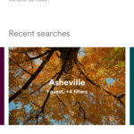
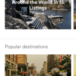
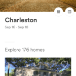
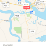
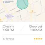
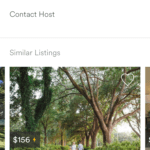
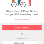
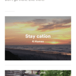
Airbnb offers an extremely simple interface. The home screen is personalized and asks, “Hi, (name). Where to next?”. Below this are several stacked panels you can scroll through: recent searches, recently viewed, Airbnb favorites, popular destinations, guidebooks, and invite friends. The bottom navigation allows for a search, inbox messages, trips information, and account information. The guidebook portion was incredibly well thought out and helpful. Again, super simple design. You simply select a destination and are brought to a page that lists out “Things to do in (destination), followed by blocks for things like “food scene”, “drinks & nightlife, “sightseeing”, “parks & nature”, “arts & culture” and more. You can click into these for a detailed list of recommendations. Or, on the main guide screen, you can view a “best of the best” list with combined overall recommendations. The search function is incredibly fast and presents a total number of listed area homes. You can then scroll blindly through listings or use the filter functionality or map view to narrow down options. The individual listing view offers a very simple way of communicating room information; guests can scroll through images, read reviews, contact the owner or book the room.






Trivago
Design: 4 / 5
Usability: 3.75 / 5
Pros: The app pulls in and compares rates across multiple other sites; great for price savvy shoppers
Cons: You cannot book directly through the app; lack of hotel profiles and hotel information
Overall Rating: 4 / 5
Comments:
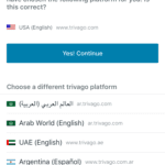
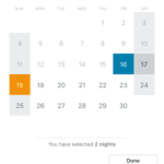
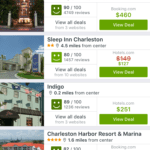
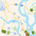
The Trivago app begins by verifying the current language system detected by the app. After confirming your language setting, you will be directed to a simple screen where you will enter a travel destination. The hotel list screen is very clean and offers a wide range of information. You can change your travel dates with a calendar tool on top of the list or apply a variety of hotel filters. The best hotel deals are also shown on this screen, provided via third parties. Upon clicking on an individual hotel, you will be greeted by a popup photo gallery. There are not actual hotel profile pages like there seem to be on other apps. Rather, Trivago provides the bare minimum on the information end and pushes you straight into the booking process. When you click “view deal” you will be directed to a page on the third party website (Booking.com, Hotels.com, etc.).



HotelsCombined
Design: 4 / 5
Usability: 4 / 5
Pros: The app pulls in and compares rates across multiple other sites; great for price savvy shoppers
Cons: You cannot book directly through the app
Overall Rating: 4 / 5
Comments:
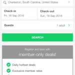
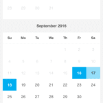
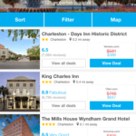
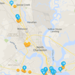
The HotelsCombined app opens with a busy home screen. You have the option to search “hotels for tonight near me” or you can enter in specific travel dates and a destination. The home screen also encourages users to register for “member only deals” and lists out the travel sites the app uses to pull and compare rates. The hotel list screen provides all of the basic hotel info (reviews, pricing, etc.) with the options to sort, filter, or view map. The hotel profiles offer a wide array of high quality hotel images and a hidden hotel overview that you can click to expand. Room types are listed right below the hotel information. The page lacks in-depth information on the area, reviews, amenities, etc. Upon selection, you are redirected to the deal page on the third party website. The app is similar but slightly more in depth than the Kayak.com app.



Once you have picked out your favorite travel booking app, check out a few of these other travel apps that might come in handy during your trip:
Gas Buddy – Find the cheapest gas prices near you
Waze – The world’s largest community traffic and navigation app.
Wikitude – Award winning augmented reality app that allows you explore destinations and discover new places.
Splittr – Cost sharing made easy.
Venmo – Another easy to use app for transferring money.
mTrip – Mobile travel guides.
WiFi Finder – Find wifi near you.
Google Translate – Free service to instantly translate words between languages.
XE Currency Exchange – Convert every currency on the go.
Lonely Planet Travel Guides – Destination guides curated by local experts.
Hopper – Predictive analytics are used to tell users when they will get the cheapest plane tickets.
Sidekix – Personalized walking guide that is generated as a user explores a new destination.
FlightCar – Drop off your car at the airport and let others rent it out while you’re away.
Dufl – Save time and money with this unique packing app.
Don’t see your favorite travel app listed? Let us know and we’ll add it to the list.
Feel free to share your thoughts in the comments below!
Think You Can’t Afford A Mobile App?
Think again. Introducing Fuel’s white label app for hotels with hotel digital key capabilities, the world’s most flexible and affordable mobile app solution for hotels. Request a free demo of our mobile app solution today!

